COOP / Case study
Simpler promotion planning
Helping store teams spend less time planning promotions and more time on the shop floor.
- My role
- UX Researcher & Designer
- Timeline
- Apr 2022–Jan 2023
- Team
- 2x UX Researchers & Designers, Coop ERGO stakeholders
Less admin.
More time in store.
Every promotion meant deciding what to order, checking quantities, and planning where products would go. Coop teams used ERGO, their inventory management application, alongside emails, intranet updates, and printed documents to bring it all together.
Store managers needed an overview. Department managers needed to order and plan quickly before returning to the shop floor. Our Master’s project explored how ERGO could better support both roles, focusing on the promotion workflow rather than redesigning the whole system.
Watch the work.
Then widen the view.
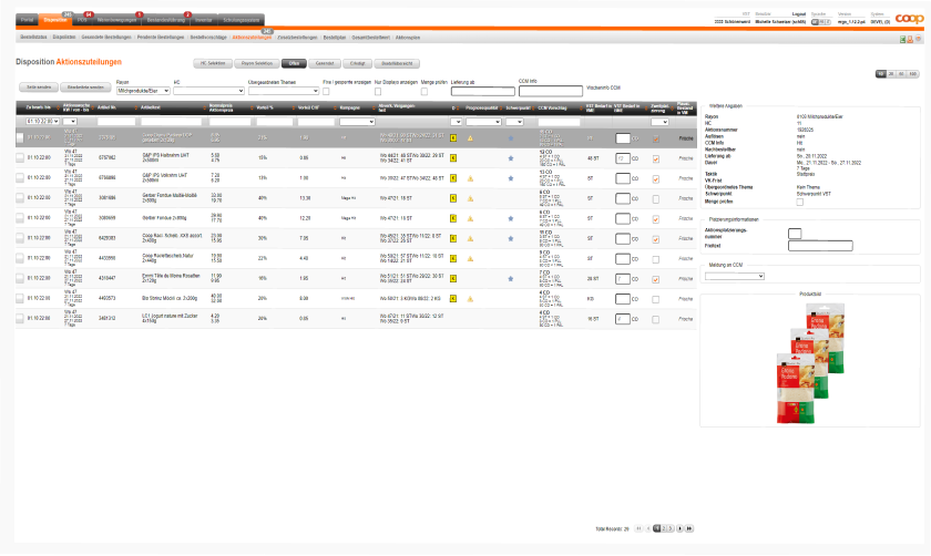
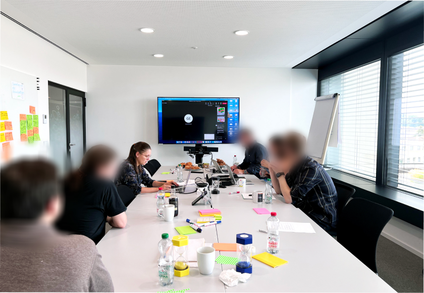
We began with seven contextual inquiries across four stores. Watching employees carry out real promotion tasks showed us the workarounds that interviews alone could miss: printed information, handwritten notes, and repeated switching between screens.
Our first visits mainly involved experienced employees in larger stores. To challenge that picture, we followed up with eight remote interviews across seven stores, including smaller stores and recently trained department managers. Screen sharing helped us compare what people said with how they actually worked.
We grouped observations in affinity maps, then built personas and journey maps for the two roles. These made the recurring problems visible and gave the team a shared basis for prioritising improvements.
Information was scattered.
Promotion updates arrived through different channels. Store managers had to keep checking sources and assemble the overview themselves.
Planning meant switching.
Department managers moved back and forth between product allocation and the promotion plan, losing time and their place in the task.
Familiarity mattered.
Employees relied on learned routines. Improvements needed to preserve recognisable cues while making useful functions easier to discover.
One place to start.
Less back and forth.
In a workshop with Coop stakeholders, we prioritised two opportunities: bring promotion information together for store managers, and connect product allocation with planning for department managers.
The prototype introduced a portal with useful information and shortcuts, plus a connected allocation-and-planning view. Employees could select products and add them to the plan without repeatedly changing screens.
- 01
Create
Build the functional prototype.
- 02
Test
Observe real tasks with users.
- 03
Iterate
Refine terms, icons, and controls.
- 04
Test again
Validate the refined workflows.
- 05
Measure
Compare task time and usability.
Testing helped us clarify terms, preserve familiar icons, and make planning controls easier to find. We also proposed onboarding to support adoption.
A tested concept.
A measurable opportunity.
The final outcome of our project with Coop was a concept validated through a functional prototype. It was not a final production UI. The prototype enabled us to measure task performance and assess the potential improvement over the existing system.
We compared selected tasks in the existing application and the prototype: finding promotion information and reaching the plan for store managers; filtering products and adding them to the plan for department managers.
The ranges describe reductions in average time for those tested tasks, not the entire promotion process. System Usability Scale scores were 85 for department managers and 92.25 for store managers. These prototype findings indicate potential improvements; they are not measured post-launch results.
Functional prototype / Concept validation
 System Info │ DE FR IT │ Filiale │ Store team
Molkerei
Früchte und Gemüse
Früchte und Gemüse
Früchte und Gemüse
1 / 4 · Promotion information in one place.